
Popular Bake Offs and Reliable Baking Recipes
Ever wondered which of the millions of chocolate chip cookie recipes is TRULY the best? Me too.
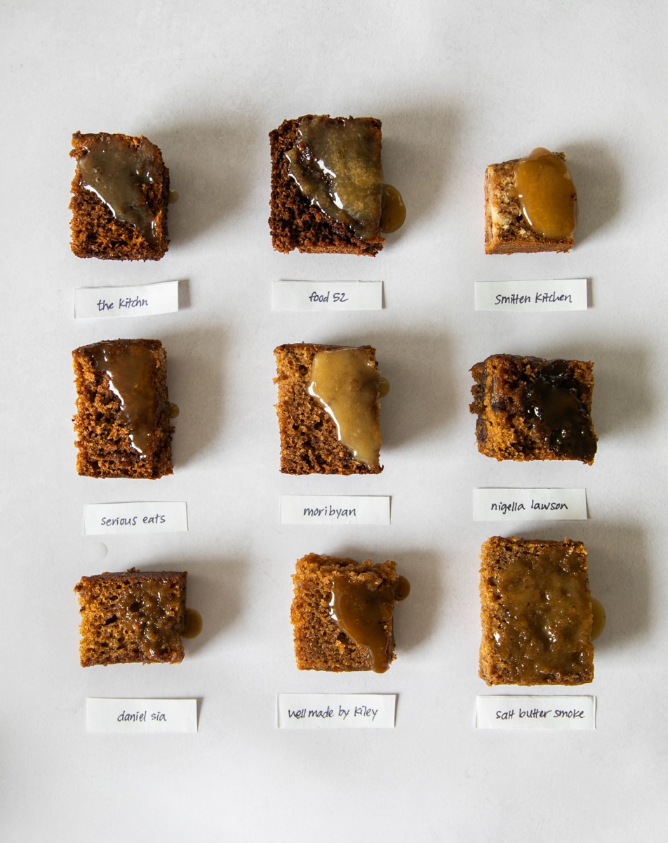
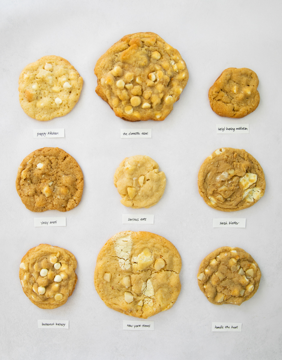
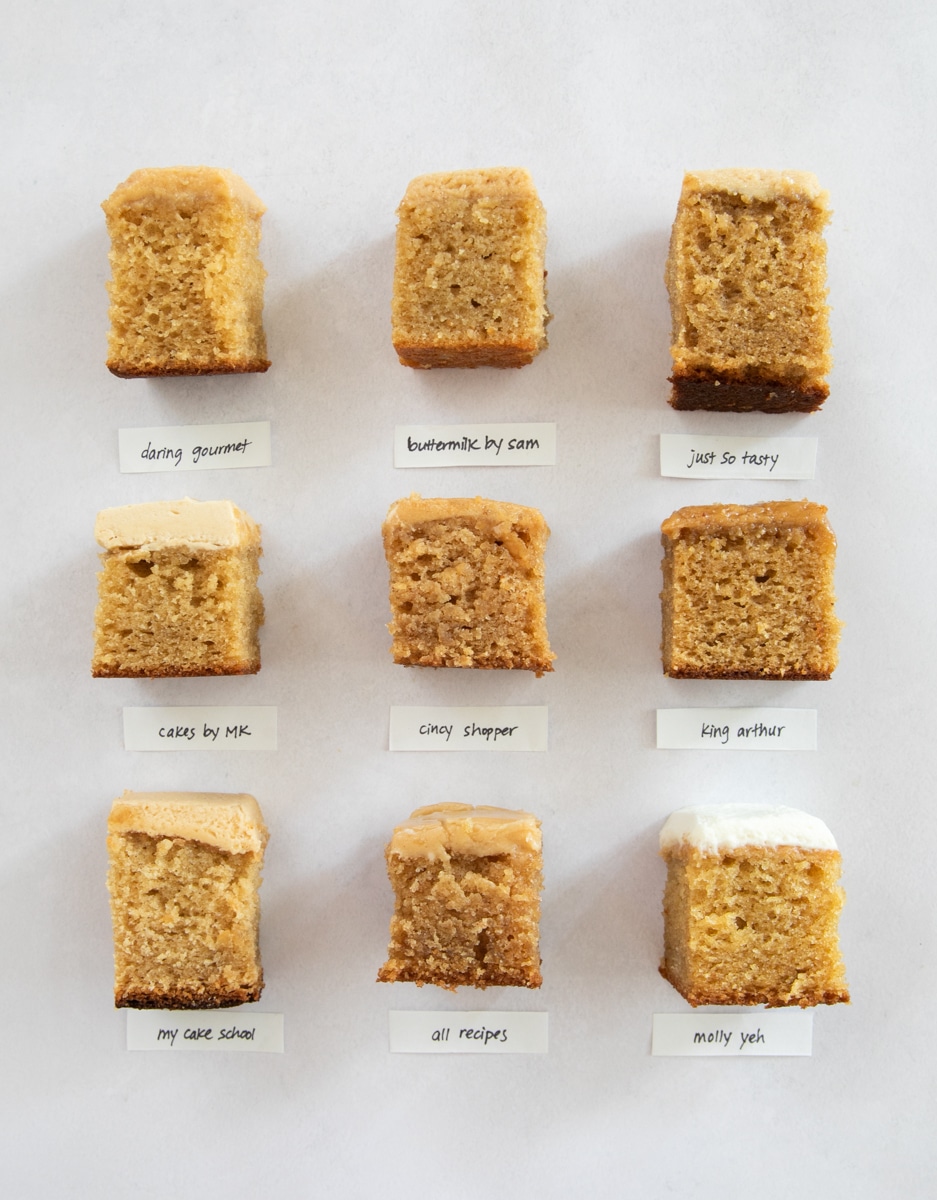
That’s what inspired the bake offs: I test popular internet recipes head-to-head, collect data from tasters and analyze the crowd favorites. I’ll also share some of my favorite, most reliable baking recipes that I love!
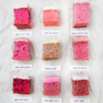
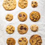
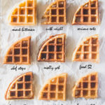
The Latest Bake Offs
See popular recipes compared and analyzed side-by-side in the bake off posts so you know exactly which recipe is right for you.
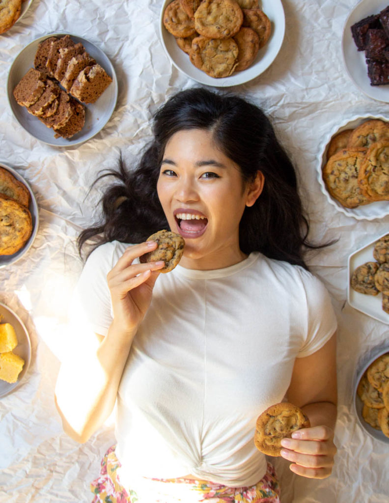
Hi, I’m Erika.
Baking recipe curator and tester.
I’m here to give you confidence that you are finding the recipe that’s right for you.
I test recipes side-by-side and use a data-driven approach to analyze and rank the “best” recipes and put it all together for you.
I also love to travel and share my experiences to help you plan your trips with ease!
The Latest Recipes
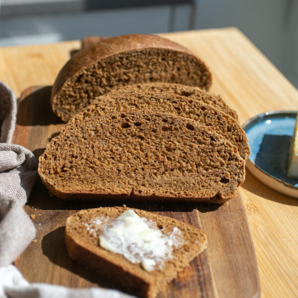
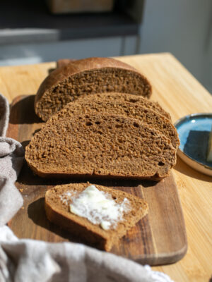
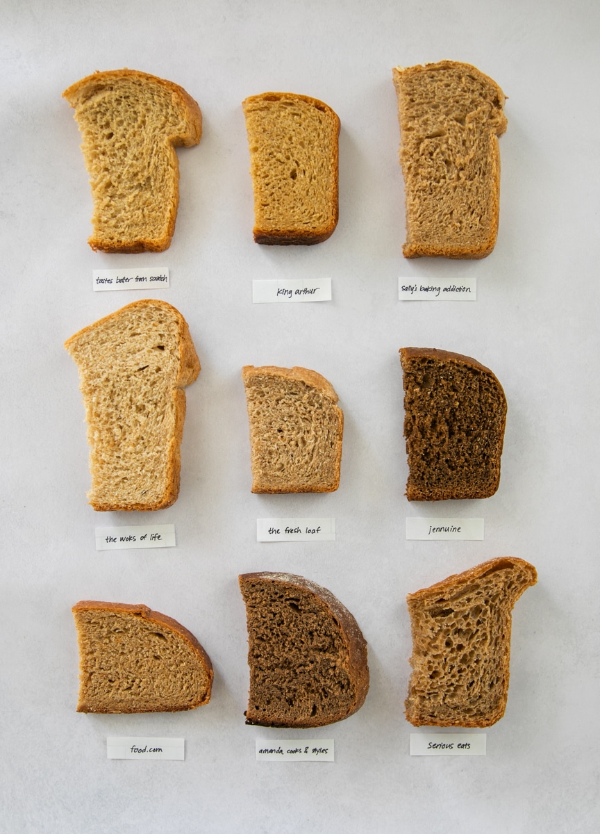
Whole Wheat Molasses Bread
This unique whole wheat molasses brown bread gets its color and faintly sweet flavor from molasses. It’s incredibly soft and tender with a slight crumbly texture as it cools. This recipe comes from San Benito House in Half Moon Bay which has the BEST sandwiches and is a family favorite! Earlier this year, I conducted…
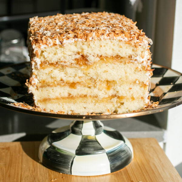
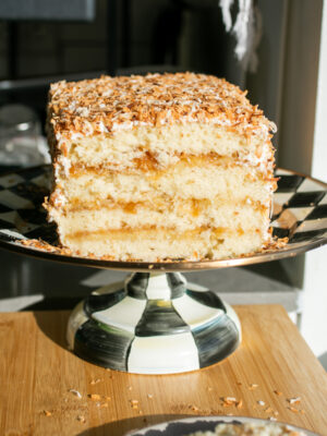
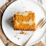
Coconut Caramel Cake
This stunning four-layer coconut caramel cake is a perfect dessert centerpiece for Easter or any spring celebration or party! Tender white cake layers are layered with coconut pastry cream, caramel and covered in toasted coconut for layers of subtle coconut flavor without the texture of coconut inside the cake. This cake was inspired by my…
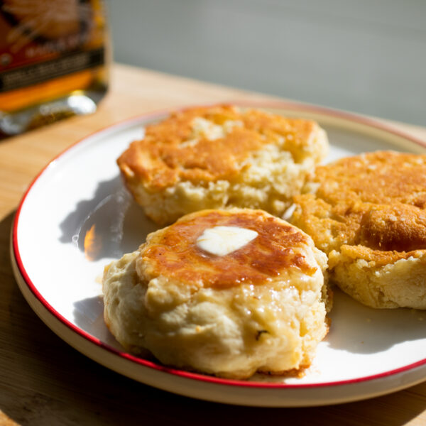
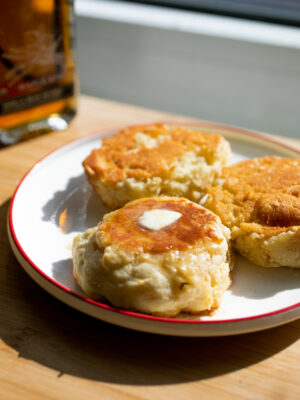
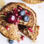
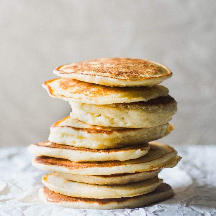
Golden Ricotta Pancakes
These golden ricotta pancakes are extremely tender, light and cakey with crusty golden edges from being baked in ghee. These are my copycat version of the famous ricotta pancakes from Lumiere Cafe in Sydney. If you visit Sydney, the most popular pancake recommendation by far will be Bills, a long-time classic cafe with excellent Australian…
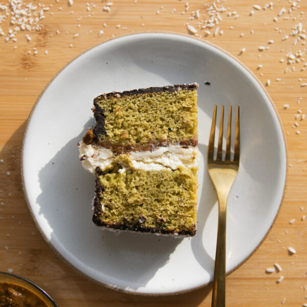
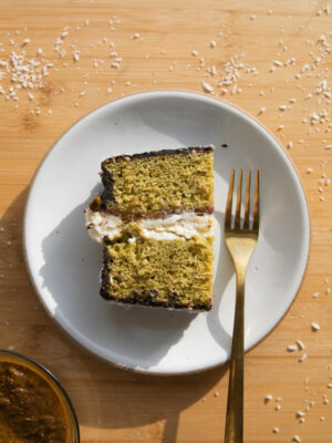
Pistachio Matcha Lamington Cake
This lamington cake features a tender pistachio and matcha cake with a rich pistachio praline filling, raspberry jam and mascarpone cream. The entire cake gets dipped in a chocolate glaze and sprinkled with shredded coconut for a uniquely delicious cake! After a recent trip to Australia, my interest in lamingtons was renewed–particularly after having some…